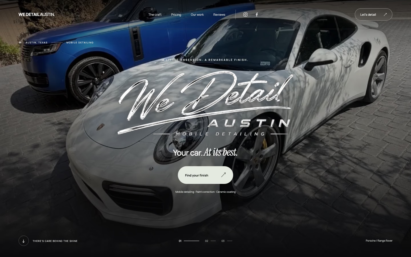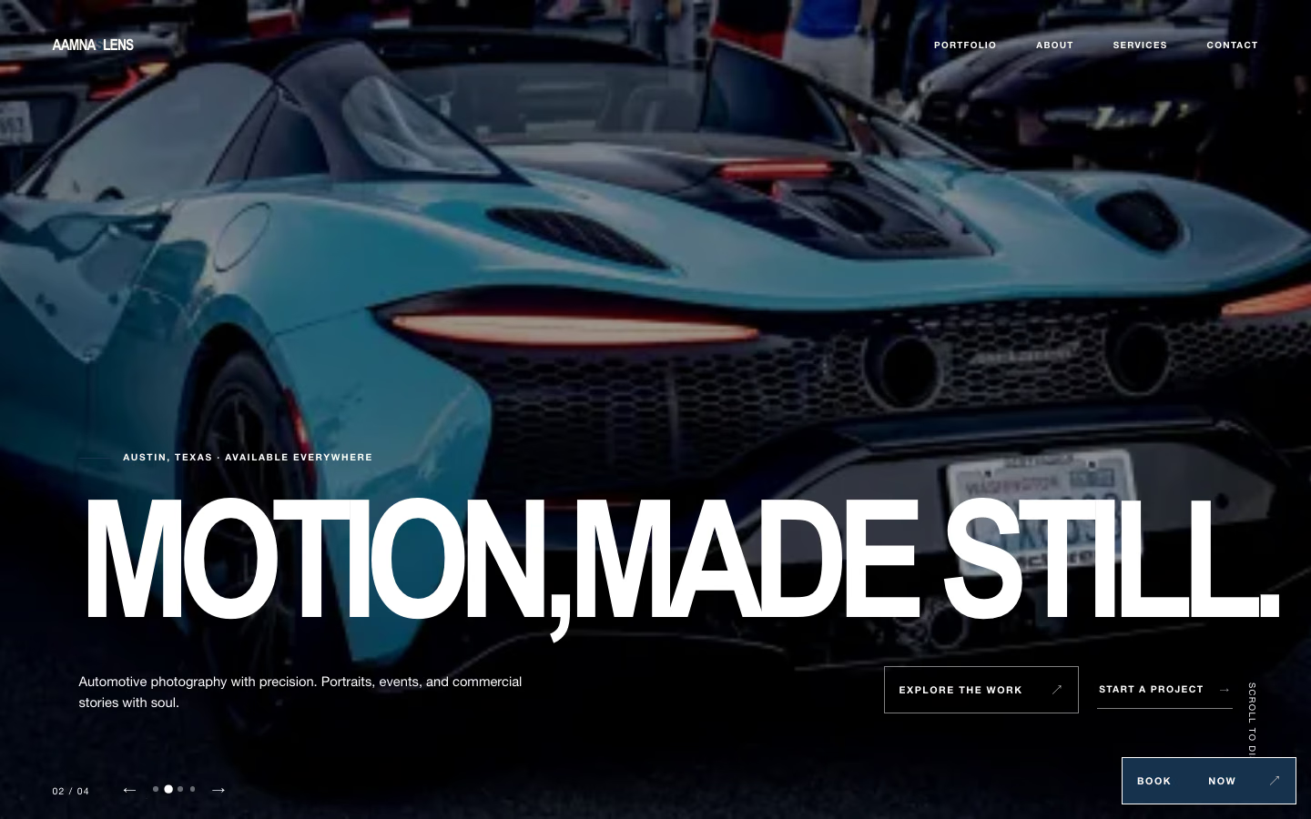
The brief
A portfolio for an Austin photographer shooting automotive and portrait work, with a strong idea of the mood she wanted — dark, cinematic, and letting the images carry the page without interface competing for attention.
The obvious tension in any photography site is that the work is the content and the work is heavy. A full-bleed hero image at the quality a photographer expects is a large file, and most portfolio platforms handle that by making the visitor wait.
What we built
A custom front end rather than a portfolio template, which made it possible to solve the weight problem properly instead of compromising on image quality.
Every image is served as responsive AVIF and WebP at several widths, with the browser picking the right one for the device and connection. The hero is preloaded with an explicit source set and high fetch priority so it starts downloading immediately rather than waiting for stylesheets and scripts to resolve. Below the fold, images load lazily with reserved dimensions so nothing shifts as they arrive.
The result is a site that opens on a phone, on mobile data, with a full-width image already there — while the images themselves are still full quality.
Structure for search
Alongside the galleries, the site is organised by session type rather than as a single undifferentiated portfolio, so each kind of work has a page that can rank for the searches that match it — automotive photography and portrait work being very different searches made by very different people.
That is the structural difference between a site that ranks for the photographer’s own name and one that can be found by someone who does not yet know it.